Mission Control: A Unified Dashboard for Nationwide Teams
A role-aware operations dashboard uniting revenue, finance, and marketing data across 270+ StorageVault locations for store teams and executives.
DATA / DASHBOARDAI / AGENTIC WORKFLOWENTERPRISE / B2BPRODUCT DESIGN
Overview
Role: Senior Designer and lead design practitioner
Timeline: 2023
Team: Store operations, regional and senior management, leadership, product delivery, engineering, and data partners
Users: Store teams across 270+ locations, 30+ regional / senior managers
Tools: FigJam for research synthesis, journey mapping, and whiteboarding; Figma for information architecture, interface design, prototyping, and handoff
Scope: Research, experience strategy, information architecture, role-based workflows, interaction design, prototyping, stakeholder alignment, and post-launch improvement


Outcome at a glance
The previous workflow had no stable baseline because each person assembled the answer differently across several tools. I have not claimed a percentage reduction in time or effort for that reason. The outcomes here are the measures and feedback the team could support.
Designed one operating view for teams across 270+ locations.
Supported two distinct levels of work: daily store operations and multi-location leadership oversight.
Earned an average post-launch user rating above 4.9 out of 5.
Established a monthly product audit that helped the team resolve issues and plan improvements.
Replaced a fragmented journey with a shared path from performance signal to supporting action.
Mission Control is the portfolio title for this case study. The final product merged into the company's existing data warehouse tool, DataVault. All data in mockups are fake display info
Understanding the Work
The problem lived between the tools
Store managers and regional leaders were running their day from four or five systems at once. Operational and financial figures lived in Excel exports. Procedures and supporting information sat in SharePoint. Conversations happened in Teams. Anything that needed follow-up became a ticket somewhere else, separated from the event or number that triggered it.
Each tool had a purpose, but the journey across them was broken. A manager could notice a problem in one report, open another source to understand it, search for a related task, and message someone to confirm what the numbers meant. The original question quickly became a hunt for context.
The organization did not lack data. It lacked a dependable way to answer three practical questions:
What needs my attention now?
Why is it happening?
What should I do next?
3- Ideate & Prototype
Developed user flows to ensure a smooth and enjoyable experience for all user groups.
Created wireframes to map out the app’s structure and interactions.
Designed high-fidelity prototypes to test usability and gather feedback.
Building the Blueprint
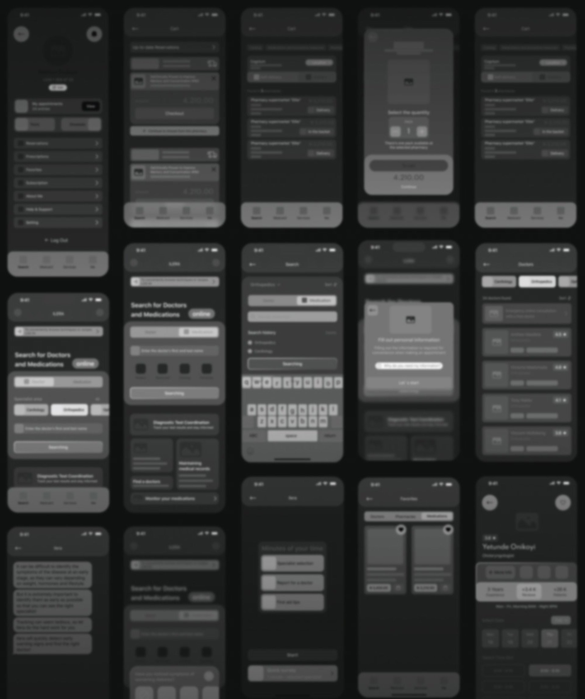
The wireframes were where the app started to take shape. I sketched out all 43 screens to map out how users would move through the app, from exploring products to chatting with consultants. It was all about making sure the flow felt natural and easy to follow. These early sketches helped me spot potential hiccups and refine the layout before diving into the visual details, so the final design was as intuitive as possible.
The Branded UI Kit
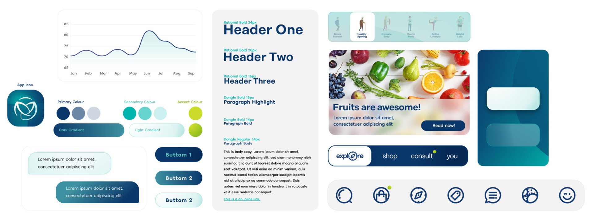
To ensure consistency, I developed a Branded UI kit covering:
Brand-aligned typography, colours, and icons.
Standardized interaction patterns.
A scalable UI kit for future updates.


My Role
As the Product Designer, I was responsible for:
Conducting user research and competitive analysis.
Creating 43 screens to accommodate diverse user flows, including edge cases and error states.
Designing user flows, wireframes, and high-fidelity prototypes.
Developing a UI kit and style guide to ensure design consistency and scalability.
Managing the handoff to developers and collaborating closely with them for seamless implementation.
Advocating for user needs by ensuring the design was intuitive, enjoyable, and aligned with user expectations.



Results & Impact
VitaMed Plus successfully transformed from a business-driven idea into a user-centered solution. By prioritizing user needs and iterating on the design, I created an app that not only boosts sales but also delivers real value to its users. The final product is a testament to the power of user research, iterative design, and cross-functional collaboration.
Reflection
This project reinforced the importance of putting users at the center of the design process. As the sole designer, I learned to balance business goals with user needs while managing the complexity of designing 43 screens, creating a UI kit and style guide, and ensuring a smooth handoff to developers. Moving forward, I aim to continue advocating for user-centered design in all my projects.