MAKING STARS OUT OF SMALL BUSINESSES
Backstory
Thilde is a startup with a big mission: to help small businesses—like restaurants, bakeries, and cafes—take control of their digital presence. Their product was an online dashboard that pulled data from four key areas:
Online Reviews (Google, Yelp, Tripadvisor)
Social Media (Instagram, Facebook, TikTok)
Search Engines (SEO optimization)
Online Orders (Uber Eats, DoorDash, etc.)
The problem? The dashboard was way too complicated. It was packed with numbers, charts, and metrics that made sense to data nerds but left small business owners feeling overwhelmed. As a Product Coach and Design Partner, my job was to turn this data-heavy monster into something simple, intuitive, and actually useful for non-tech-savvy users.


Understanding the Problem
Before jumping into solutions, I needed to really understand the users. I spent time talking to small business owners—restaurant managers, bakery owners, café operators—and learned a few key things:
They’re busy. Running a small business is a 24/7 job. They don’t have time to dig through complicated dashboards.
They’re not tech experts. Terms like “CAC” or “engagement rate” might as well be in another language.
They want clarity. They needed to know, at a glance, how they were doing and what they could do to improve.
This research became the foundation for everything I did next.
The Spark: A Star is Born
The idea for the Shine Index didn’t come from a fancy brainstorming session or a high-tech lab. It came during the early steps of our research and wireframing phase. We were knee-deep in user interviews, trying to figure out how to make sense of all the data, when it hit us: what if we could show businesses how they “shine” compared to others? Like stars in a galaxy, some shine brighter, and others need a little boost.
This metaphor became the heart of the redesign. It wasn’t just about simplifying data—it was about giving users a way to see their performance in a way that felt natural and inspiring.
Process: Chaos to Clarity
Here’s how we turned that spark into a fully functional, user-friendly dashboard:
1- Research & Discovery
We began by conducting user research, including interviews and surveys, to understand the pain points of small business owners. Key insights included:
Most users found existing analytics tools confusing and overwhelming.
Users needed clear, actionable insights rather than raw data.
A visual representation of performance would be more intuitive than complex reports.
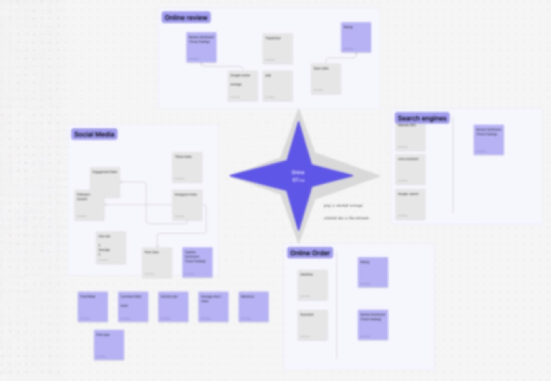
2- Information Architecture & Wireframing
To structure the dashboard effectively, we:
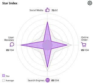
Organized data into four key areas (Reviews, Social, SEO, Orders).
Created low-fidelity wireframes to map out user flows and ensure easy navigation.
Prioritized clarity by reducing clutter and focusing on essential insights.
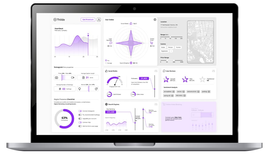
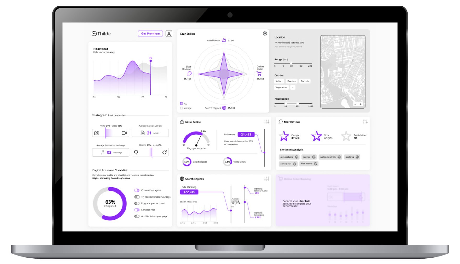
3- Concept Development: Shine Index
This is where the star metaphor really came to life. We wanted to create a visual representation of performance that was both simple and inspiring. Here’s what we came up with:
A colored star to show the business’s performance in each category.
A gray star to represent the market average, giving users a clear benchmark to compare against.
A gamified approach that encouraged users to improve their standing and “shine brighter.”
The Shine Index wasn’t just a design element—it was a way to make data feel approachable and even a little fun.
4- UI & Visual Design
With the concept in place, it was time to bring it to life. Here’s how we made the dashboard visually engaging and intuitive:
Used infographic-style visuals to simplify complex data and make it easy to digest.
Implemented a color-coded system to highlight performance at a glance.
Ensured mobile responsiveness so users could access insights anytime, anywhere.
We also added interactive elements, like hover tooltips and clickable panels, to encourage exploration without overwhelming users.
Challenges Along the Way
It wasn’t all smooth sailing. One of the biggest challenges was balancing simplicity with depth. Users wanted a quick overview, but they also needed access to detailed data when they needed it. To solve this, we designed the dashboard to be layered:
The Shine Index gave them the big picture.
Clicking on a star spike or panel would reveal more detailed insights.
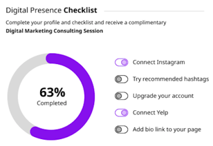
Another challenge was making the dashboard feel actionable. It wasn’t enough to show users how they were doing—they needed to know what to do next. That’s why we added the actionable list in the “YOU” section, which provided clear, step-by-step recommendations to improve their score.

Outcome
The redesigned dashboard was a hit. Users loved the Shine Index—it gave them a quick, easy way to understand their performance without drowning in data. They also appreciated the actionable insights, which made the dashboard feel less like a report card and more like a tool to help them grow.
What I Learned
This project taught me a lot about the power of simplicity and storytelling in design. By using a visual metaphor like the Shine Index, I was able to turn a complex, data-heavy dashboard into something intuitive and engaging.
I also learned the importance of listening to users. The initial design was based on assumptions, but it was the feedback from real users that helped me refine the concept and make it truly effective.